
In today’s fast-paced digital world, more people than ever are browsing websites from their mobile devices. If you want your WordPress website to succeed, optimizing it for mobile SEO is a must. As mobile traffic continues to grow, Google’s algorithm now prioritizes mobile-friendly websites. So, let’s dive into some key factors you need to consider when optimizing WordPress for mobile SEO. Don’t worry, I’ll keep it simple and fun!
1. Choose a Mobile-Friendly WordPress Theme
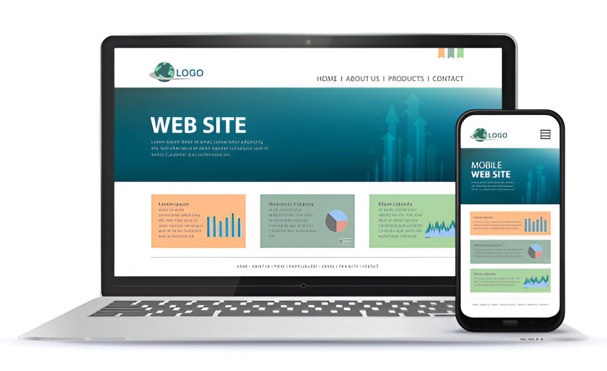
The first step in optimizing WordPress for mobile SEO is picking the right theme. Many themes claim to be mobile-responsive, but not all deliver a smooth experience on smaller screens. A mobile-responsive theme adjusts your site layout automatically to fit the device used, making sure everything looks good and is easy to navigate.
When I first started building my WordPress site, I was overwhelmed by the number of themes available. But once I found a truly mobile-responsive theme, my traffic from mobile users improved dramatically. A good tip is to test a theme on different devices (phones, tablets) before fully committing. A poor mobile experience can drive visitors away, which hurts your SEO.
2. Optimize Page Load Speed for Mobile Devices
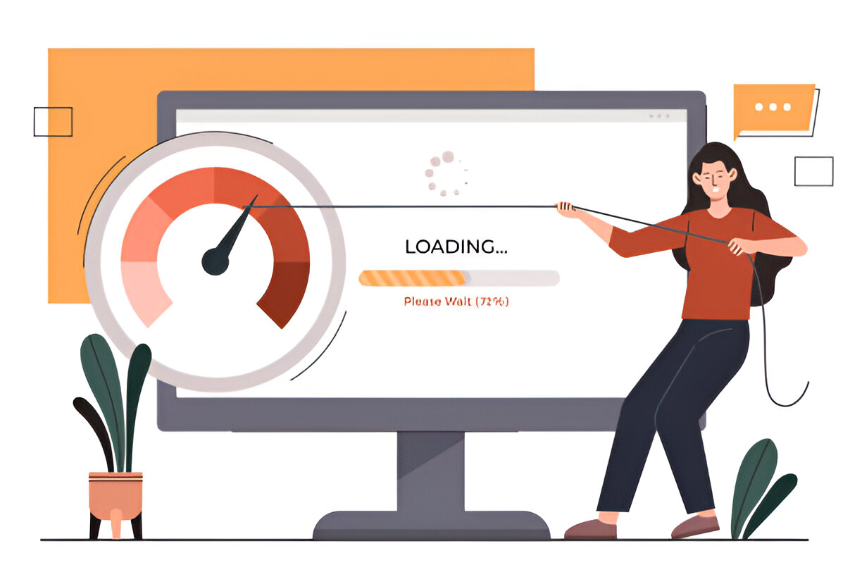
Let’s face it, nobody likes waiting for a website to load, especially on mobile. One of the key ranking factors for Google’s mobile-first indexing is page speed. If your WordPress site takes too long to load on a mobile device, users will bounce, and Google will notice. That’s bad news for your SEO.
To improve speed, I recommend using a caching plugin like WP Super Cache or W3 Total Cache. These plugins store copies of your web pages and serve them to users, cutting down load times. You should also optimize your images using a plugin like Smush or TinyPNG. Large, uncompressed images can slow down your mobile site considerably.
3. Use Accelerated Mobile Pages (AMP)
If you haven’t heard of AMP (Accelerated Mobile Pages), now’s the time to learn. AMP is an open-source project designed to make web pages load faster on mobile devices. By using a stripped-down version of HTML, AMP pages are super lightweight and load almost instantly.
WordPress makes it easy to integrate AMP with plugins like the official AMP plugin by WordPress. By enabling AMP, you ensure your content is delivered lightning-fast to mobile users, which not only improves user experience but also gives your SEO a nice boost. Plus, AMP pages can appear in Google’s mobile carousel, giving your content more visibility.
4. Optimize for Touchscreen Usability

When optimizing WordPress for mobile SEO, it’s important to think about how users interact with your site. On mobile, users aren’t clicking with a mouse; they’re tapping with their fingers. Buttons, links, and other interactive elements need to be large enough for users to tap without frustration.
I learned this the hard way when visitors to my WordPress site complained about tiny buttons and difficult navigation. After increasing the size of clickable elements and spacing them out, my bounce rate dropped, and mobile engagement skyrocketed. Google tracks user experience metrics like these, and improving them can positively impact your mobile SEO.
5. Mobile-Friendly Popups: Less is More
Popups can be a great tool for collecting emails or promoting offers, but they can be annoying on mobile. If a popup covers most of the screen, users are likely to abandon your site. Worse, Google penalizes sites that have intrusive mobile popups, as they negatively affect the user experience.
To keep things mobile-friendly, I use timed popups or ones that appear when the user scrolls. This way, popups don’t interfere with the content. If you must use a popup, make sure it’s small, easy to close, and doesn’t disrupt the user experience. This will help keep both your visitors and Google happy.
For more information read: How to Perform an SEO Audit on Your WordPress Site.
6. Improve Mobile Navigation with Simple Menus

One of the best ways to improve mobile SEO for your WordPress site is by simplifying your navigation. Mobile users don’t have the luxury of large screens, so navigating your site should be as straightforward as possible. Use a hamburger menu (the three-line icon) to keep things neat and organized.
I used to have a complex menu on my WordPress site with too many categories and subcategories. Mobile users found it confusing, and it showed in my site’s performance. After switching to a simpler menu layout, visitors could find what they were looking for faster, and my mobile SEO improved. The easier it is to navigate, the longer users will stay on your site.
7. Optimize Content for Mobile Users
It’s not just the layout of your WordPress site that matters for mobile SEO—it’s also your content. Mobile users typically skim through content rather than reading word for word, so make your content easy to digest. Break up text into short paragraphs, use subheadings, and include bullet points or numbered lists.
Another tip is to use a larger font size. I used to have tiny fonts on my mobile site, making it hard for users to read. Once I increased the font size, mobile engagement improved. You want your content to be as readable and user-friendly as possible. Google tracks engagement metrics like time on page, so keeping your mobile users happy is crucial for SEO.
8. Ensure Your WordPress Site is Mobile-First Indexed
Since Google’s shift to mobile-first indexing, it now primarily uses the mobile version of your site for ranking. This means your mobile version is more important than ever. If your WordPress site isn’t optimized for mobile, it could negatively impact your rankings, even on desktop search.
I like to think of the mobile version of my WordPress site as the “main” version. This mindset helps me prioritize mobile optimization, ensuring that everything from design to content works perfectly on small screens. To check how Google views your site, you can use Google’s Mobile-Friendly Test tool. It provides a snapshot of how well your site performs on mobile devices.
9. Optimize Your WordPress Images for Mobile
Images play a big role in your WordPress site’s appearance and SEO, but they can also slow down your mobile site if not optimized. On mobile, users expect images to load quickly and look sharp. This is where responsive images come in.
WordPress automatically serves different image sizes based on the user’s device, but you should still optimize images to reduce their file size without sacrificing quality. I recommend using tools like Imagify or ShortPixel, which automatically compress images for you. This way, you can keep your mobile site fast while maintaining great visuals.
10. Test Your WordPress Site on Multiple Devices

Last but not least, test your WordPress site on as many mobile devices as possible. Different phones and tablets have different screen sizes, resolutions, and processing power. What looks great on one device might be clunky on another.
I like to test my site on both iOS and Android devices to ensure it performs well across platforms. You can also use browser tools like Chrome’s DevTools to simulate different devices. Regular testing helps catch issues before they hurt your SEO.
Conclusion
Optimizing WordPress for mobile SEO doesn’t have to be complicated, but it is essential if you want to stay competitive. By choosing a responsive theme, improving page speed, using AMP, and enhancing mobile usability, you’ll create a better experience for your visitors—and Google will reward you for it. Remember, as mobile traffic continues to grow, having a mobile-optimized WordPress site is no longer optional—it’s a must!
For more insights on technology and innovation, visit TheBrandWick.